By Cathy Bossolina
Paint color is one of the most impactful and least expensive changes a homeowner can make, and it is also one of the most frequently overthought. The choices that work best in
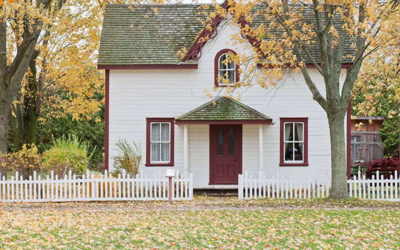
Ridgewood homes, where natural light shifts significantly between north and south-facing rooms and where Colonial and Tudor architecture sets a strong baseline for warm, grounded palettes, are rarely the ones that look best on a sample card under fluorescent lighting at the paint store. Here is a practical approach to getting it right.
Key Takeaways
- Learn how light direction affects color perception in each room and why a color that works in one exposure fails in another.
- Discover which paint finishes suit which rooms and why the sheen level matters as much as the color itself.
- Find out how to build a whole-home palette that flows naturally from room to room without feeling monotonous or disconnected.
- Understand which color choices add the most value when preparing a Ridgewood home for sale.
How Light Changes Everything
The single most important variable in choosing a paint color is the direction the room faces. A warm white that glows in a south-facing kitchen can look dingy and yellow in a north-facing bedroom. Testing colors in the actual room, in both natural and artificial light, is not optional.
How to Account for Light in Your Color Decisions
- North-facing rooms receive cool, indirect light throughout the day, which pulls warm colors toward gray and makes cool colors appear even cooler, so warmer whites, soft greiges, and muted earthy tones tend to perform better than stark whites or cool blues.
- South-facing rooms get the most consistent and flattering natural light, which means they can handle a wider range of colors, including deeper tones that would feel oppressive in a darker space.
- East-facing rooms are bright and warm in the morning and cool in the afternoon, which makes them well-suited to soft warm whites and pale yellows that perform well across that shift.
- West-facing rooms receive golden afternoon and evening light, which flatters warm tones like terracotta, amber, and rich neutrals while making cooler grays look flat during the hours when those rooms are most used.
Choosing by Room
Beyond light direction, each room has a functional purpose that should inform its color. A bedroom serves a different psychological role than a kitchen, and the palette should reflect that.
The Right Approach for Each Room Type
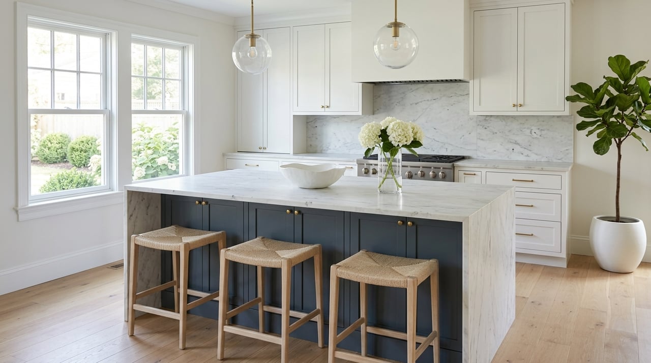
- Kitchens benefit from clean, energizing tones that support activity and appetite, with soft whites, warm creams, and pale sage greens consistently performing well in Ridgewood's Colonial kitchens without competing with natural wood tones or marble countertops.
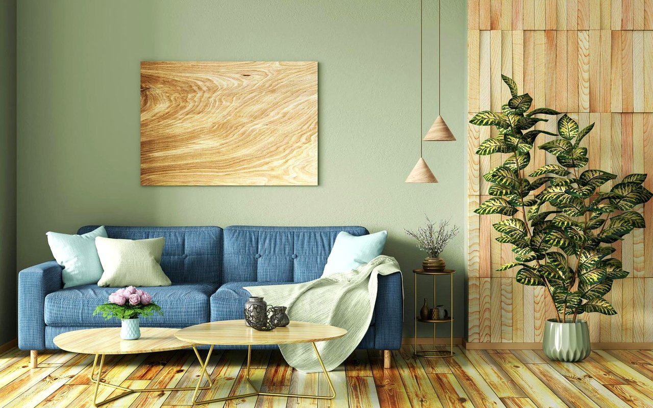
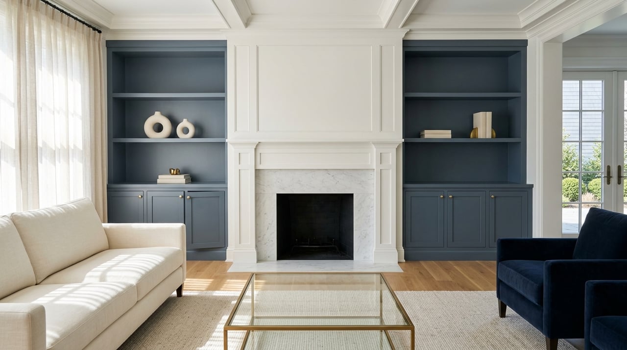
- Living rooms and dining rooms are where richer, more saturated colors earn their place, with deep navy, forest green, burgundy, and warm charcoal creating the sense of enclosure and warmth that makes formal gathering spaces feel intentional.
- Bedrooms perform best in muted, desaturated tones that recede rather than activate, including soft blue-greens, warm taupes, dusty mauves, and any color whose undertone reads calming rather than stimulating under evening lighting.
- Home offices benefit from colors that support focus without fatigue, with soft greens and warm off-whites consistently performing better than stark white, which creates glare on screens, or bold colors, which compete with concentration over long periods.
Finish Matters as Much as Color
The sheen level of a paint finish affects how the color reads on the wall and how the surface performs over time. Using the wrong finish in a high-traffic room or a room with imperfect walls amplifies problems the color itself would otherwise mask.
Which Finishes Belong Where
- Flat and matte finishes absorb light rather than reflecting it, which makes colors appear truer and walls look smoother, making them the right choice for ceilings and low-traffic formal rooms with well-prepared walls.
- Eggshell and satin finishes offer a low sheen that holds up to cleaning and moisture, making them the standard choice for living rooms, bedrooms, hallways, and most general living spaces in a Ridgewood home.
- Semi-gloss and gloss finishes are appropriate for trim, doors, cabinetry, and bathrooms, where durability and easy cleaning matter more than the subtle flatness that reads as refined in other contexts.
- Flat paint on ceilings is a universal rule because sheen on a ceiling picks up every imperfection and every light fixture reflection in a way that makes even a well-plastered ceiling look worse than it is.
Building a Whole-Home Palette
Individual room choices that look good in isolation can feel disconnected when a home is viewed as a sequence of spaces. A cohesive whole-home palette uses one or two anchor neutrals and then varies saturation and tone across rooms rather than introducing unrelated color families in each space.
How to Create Flow Across Rooms
- Choose one neutral as the backbone of the main level, a warm white, a soft greige, or a light warm gray, and use it consistently in transitional spaces like hallways and foyers so the eye has a resting point between rooms.
- Introduce color in rooms where a door or threshold provides a visual break, which allows each space to have its own identity without jarring the transition as you move through the home.
- Pull accent colors from existing fixed elements, including flooring, countertops, fireplace surrounds, and tile, so the palette feels derived from the home rather than imposed on it.
- Test final color selections as large painted samples on the actual wall, at least twelve by twelve inches, viewed over several days and under both natural and artificial light before committing to a full room.
Frequently Asked Questions
What paint colors add the most value when selling a Ridgewood home?
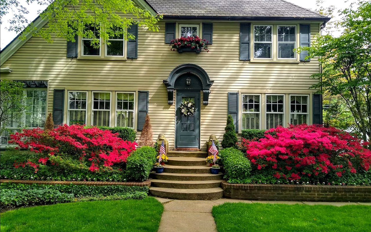
Soft, warm neutrals consistently outperform bold or highly personal color choices in a listing context because they allow buyers to project their own vision onto the space rather than having to mentally override the existing palette. Benjamin Moore's White Dove, Sherwin-Williams Accessible Beige, and any warm off-white in the greige family are reliable choices that photograph well and read as move-in-ready.
How many paint colors should a home have?
Most designers recommend three to five colors for an entire home: one primary neutral for the main living areas, a slightly warmer or cooler variation for secondary spaces, one or two accent colors for rooms where a stronger statement is appropriate, and a consistent trim color throughout. Exceeding that range usually produces a home that feels busy rather than curated.
Is it worth hiring a color consultant before painting a home for sale?
For sellers preparing a Ridgewood home for market, a two-hour consultation with a color specialist typically costs between $200 and $400 and consistently pays for itself in the resulting presentation. A poorly chosen paint color in a primary room can affect buyer perception immediately and create a negotiating point that costs far more than the consultation would have.
Color Choices Are Part of What Sells a Home
Buyers in Ridgewood notice paint immediately, and the homes that show best are the ones where the palette was chosen with both the architecture and the light in mind. Whether you are preparing to list or simply updating the home you plan to stay in, I am happy to share what I have seen work in this market and connect you with the resources to get it done well. Reach out to me,
Cathy Bossolina, whenever you are ready to talk.